Widget Click2Contact

Author: Łukasz Strumiński
Created: 2018-03-20. Updated: 2023-01-09.
The Click2Contact widget allows you to place chat or callbacks on your company's website. You can configure it to best suit your needs and the style of your website.
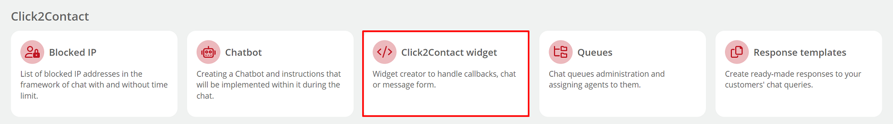
From the Administration tab, select Click2Contact → Click2Contact widget.
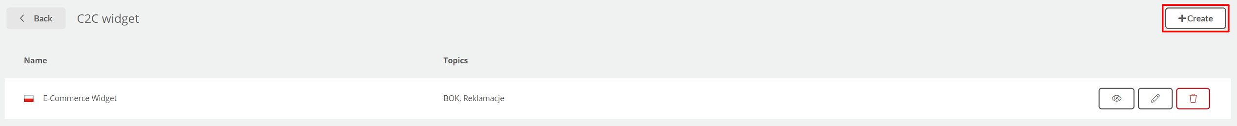
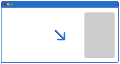
Then click the 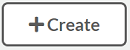 button in the upper right corner.
Omówmy teraz poszczególne parametry konfiguracyjne:
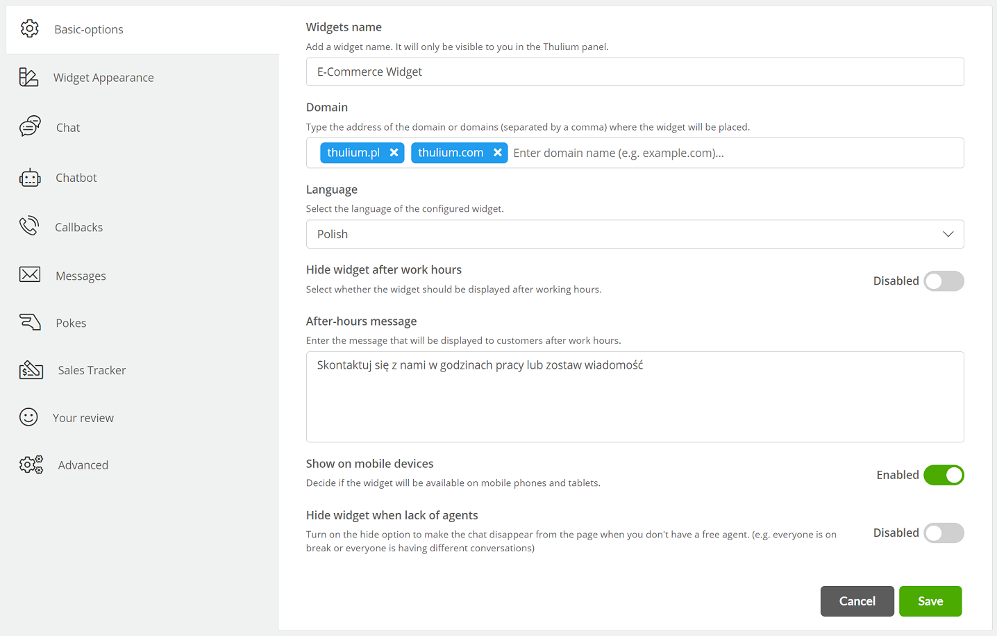
- Widget name - enter the name of the widget that will be visible only to the user (mandatory field),
- Domain - enter the name of the domain or domains on which the chat will be available (mandatory field),
- Language - select the language of the widget, choose from: English, Polish, Czech, Danish, Slovak, Romanian, German, French, Spanish, Dutch, Estonian, Lithuanian, Latvian, Ukrainian, Hungarian, Italian and Portuguese,
- Hide widget after work hours - the ability to hide the chat widget during off-hours,
- After-hours message - enter a message informing the customer to contact you outside business hours,
- Show on mobile devices - ability to display chat on mobile devices,
- Hide widget when no agents available - ability to hide widget when there are no free agents (free agent - on "Free" status and has at least one chat under limit).
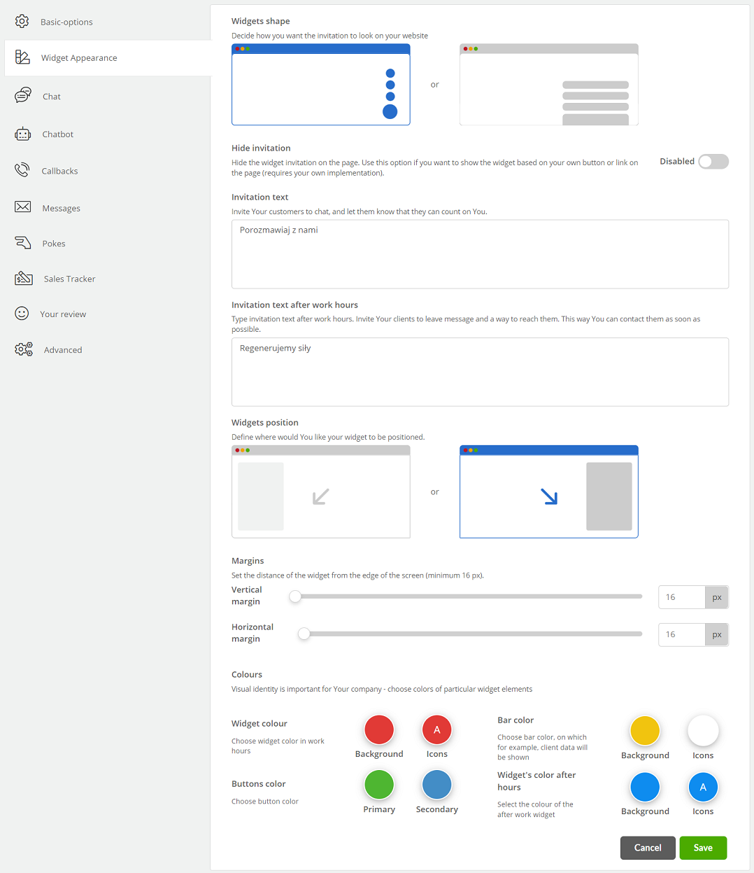
- Shape of the widget - specify whether the chat will be displayed as:
a) circle
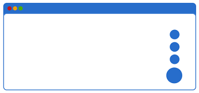
b) a bar
- Hide invitation - option to hide the invitation to show your own button or embed the widget within a button on the page,
- Invitation text - enter text to encourage contact e.g. "Write to me",
- Invitation text after work hours - enter the text that will appear to the customer when contacted after business hours,
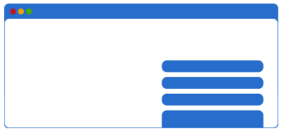
- Widget position - decide on which side of the screen the chat will be displayed.
a) left
b) right
-
Margins - the ability to set the distance of the widget from the edge of the screen (minimum 16 px),
-
Colors:
- Widget color - choose the color of the invitation (bar or circle),
- Widget color after hours - choose the color of the invitation after business hours,
- Buttons color - choose the color of the main and secondary button.
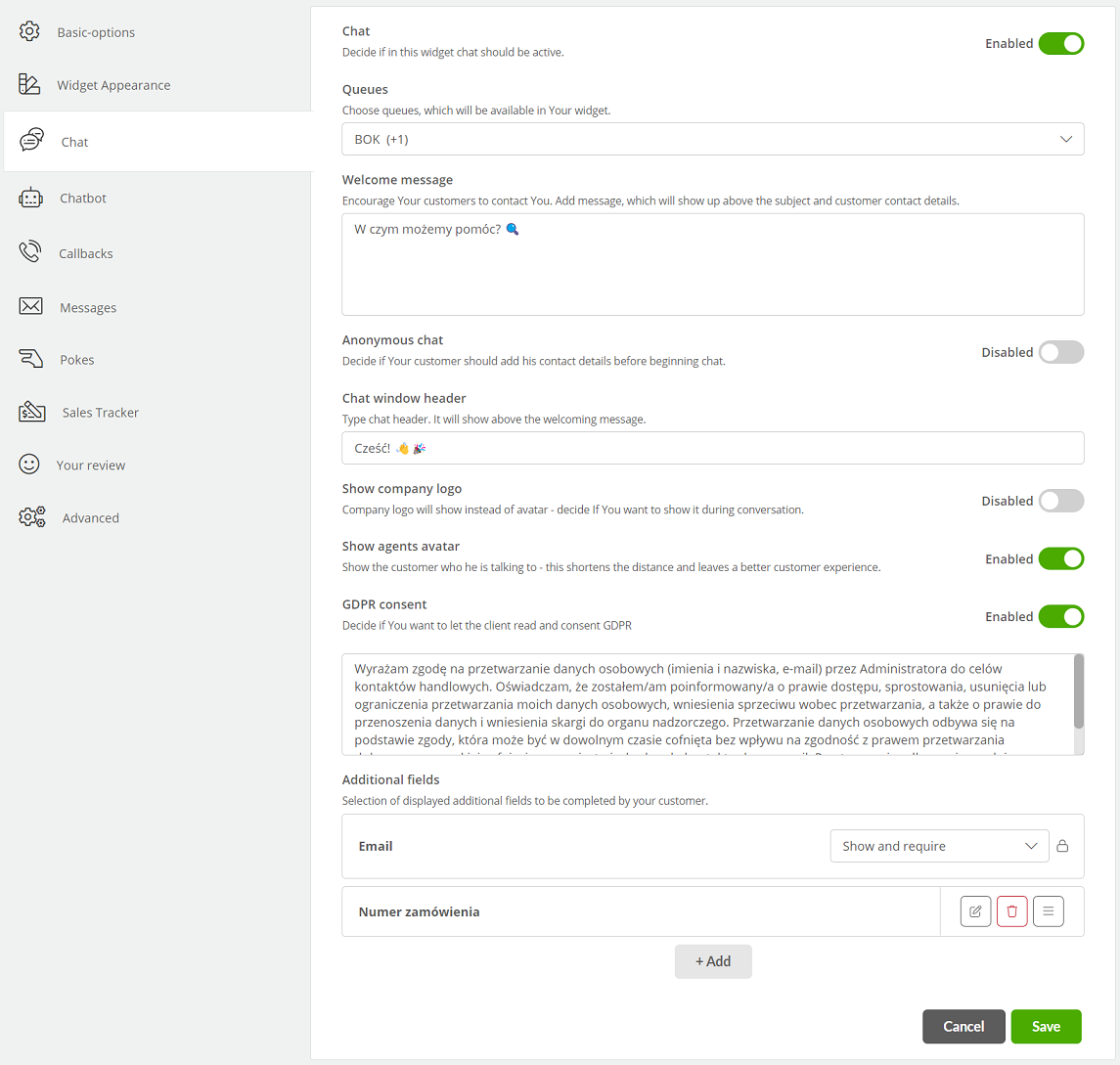
- Chat - enable the chat option within the widget,
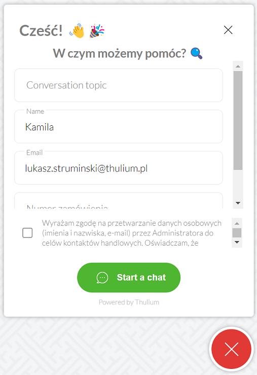
- Queues - select queues where chats from this widget will go. When more than one queue is selected then when starting a chat, the customer will be able to select the queue/case in which he/she is writing (e.g. queues: Sales, Complaints, Inquiries),
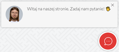
- Welcome message - enter a welcome message appearing in the upper left corner of the chat window (above the chat topic),
- Anonymous chat - the ability to start a chat conversation without having to enter data (name and email address),
- Chat window header - enter the text that will appear in the header of the chat window,
- Show company logo - ability to display company logo instead of agent avatar during chat,
- Display agent avatar - ability to display agent avatar during conversation,
- GDPR consent - ability to display a field with consent to process personal data.
Did you know...💡
As part of the GDPR consents and welcome message, you can insert a link to the site by typing {{href(https://www.example.com|Text)}}} or {{href(https://www.example.com|Text)}}
-
Additional fields:
- E-mail - decide whether the field with e-mail address will be displayed, three options appear:
- Hide - the e-mail field will be hidden,
- Show - the e-mail field will be shown,
- Show and require - the email field will be shown and required,
- Add - possibility to add additional text field(s) to be completed by the customer, e.g. order number. This field will appear under the email address - to do so click
 .
.
- E-mail - decide whether the field with e-mail address will be displayed, three options appear:
Did you know...💡
Within the additional fields, you can specify such as required by clicking on the  checkbox.
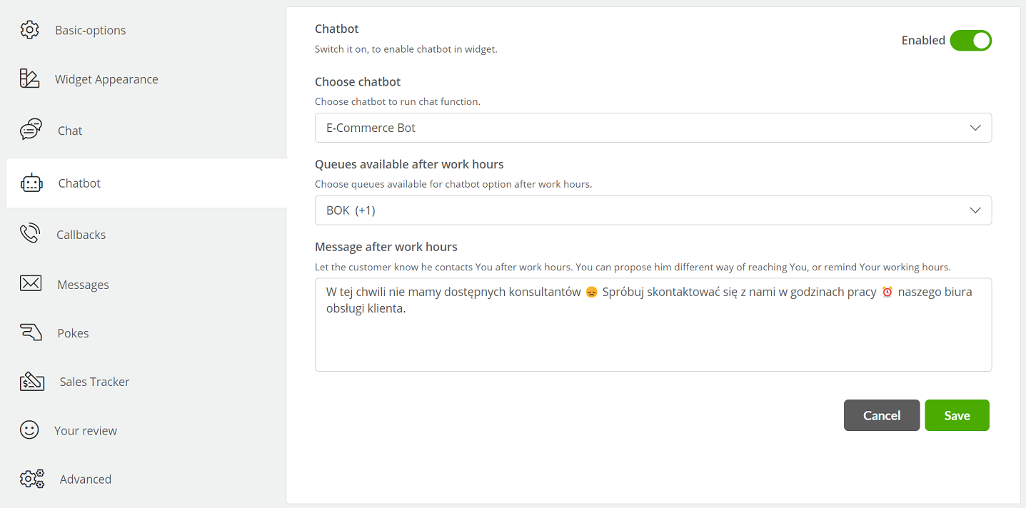
- Chatbot - launches a bot for a given widget,
- Choose chatbot - selects an available bot from the list,
- Queues available after work hours - what queues are to be available after hours for the bot to handle,
- Message after work hours - content of the message displayed to the customer, after hours queue when trying to contact the agent.
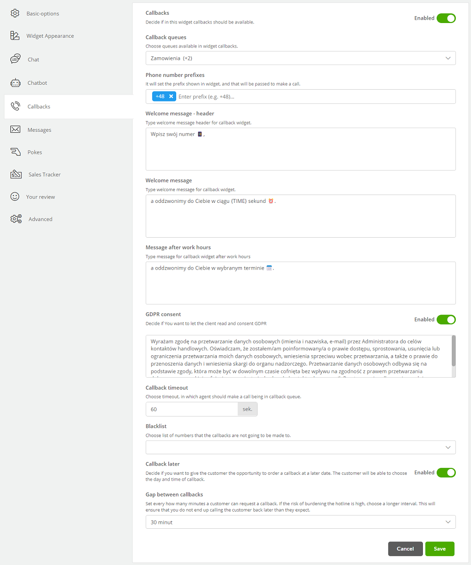
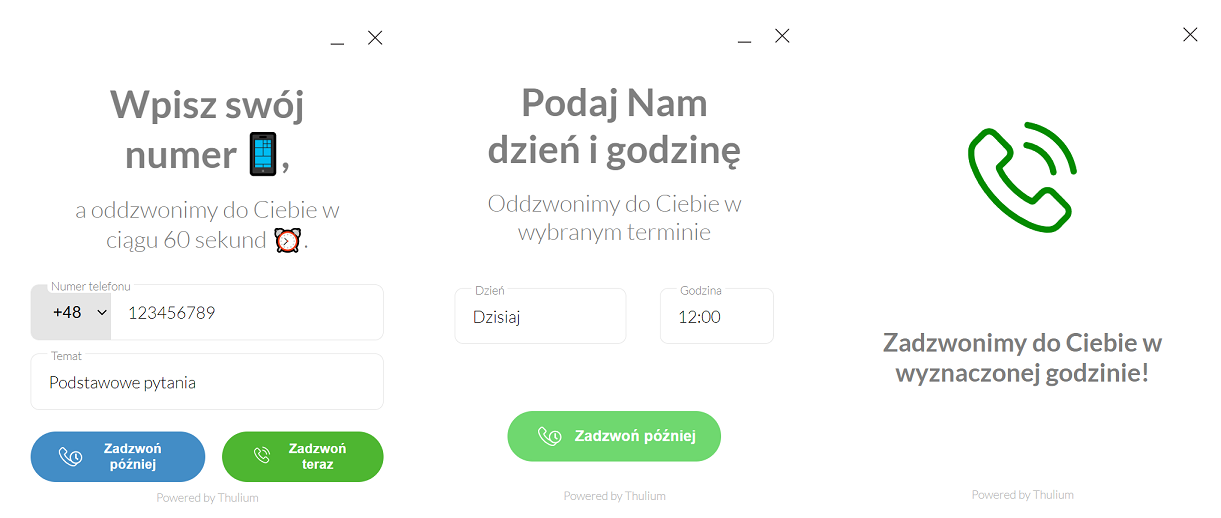
- Callbacks - enable callbacks within the widget,
- Callback queues - select the infoline queue(s) from which the callback will occur,
- Phone number prefixes - the prefix that will be displayed in the widget and will be forwarded to the Operator for callback,
- Welcome message - header - enter the message content that will appear in the message header,
- Welcome message - enter the content of the welcome message,
- Message after work hours - enter the message that will be displayed after callback queue hours or when choosing to call back later,
- GDPR consent - option to display a field with consent to process personal data,
- Callback timeout - decide at what time a callback will take place,
- Blacklist - you can choose a black list of numbers to which callback will not be performed,
- Callback later - allows you to order a callback at a later date,
- Gap between callbacks - set a time jump (within the hours of the callback queue) in which a callback is to take place, e.g. 5, 10, 15, 30 minutes.
a) 
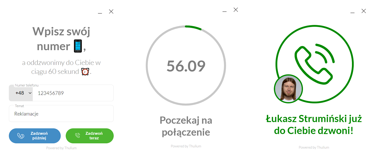
b) 
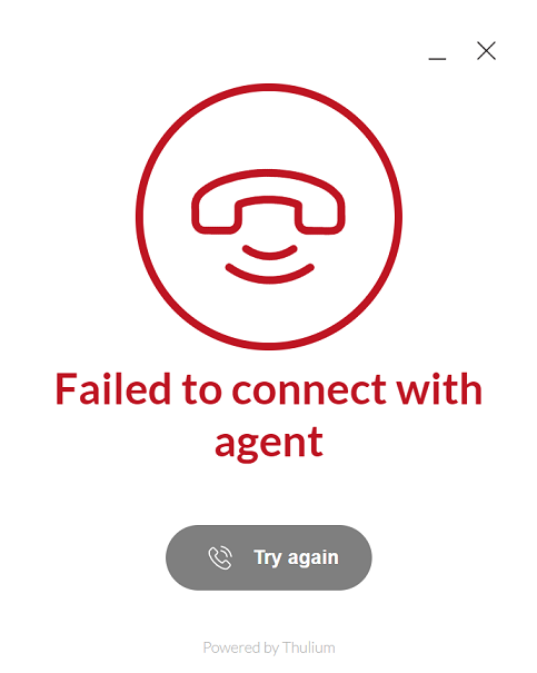
In case of failure (the connection failed), it is possible to use the "Try Again" option from the Customer side:
If you select more than one queue for Callbacks within the widget, you will see an option to select the topic of the call:
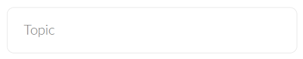
It is possible to set a specific topic name within configure a particular queue.
To define what number will be displayed to the customer in case of a callback, select the appropriate queue in outbound call routing.
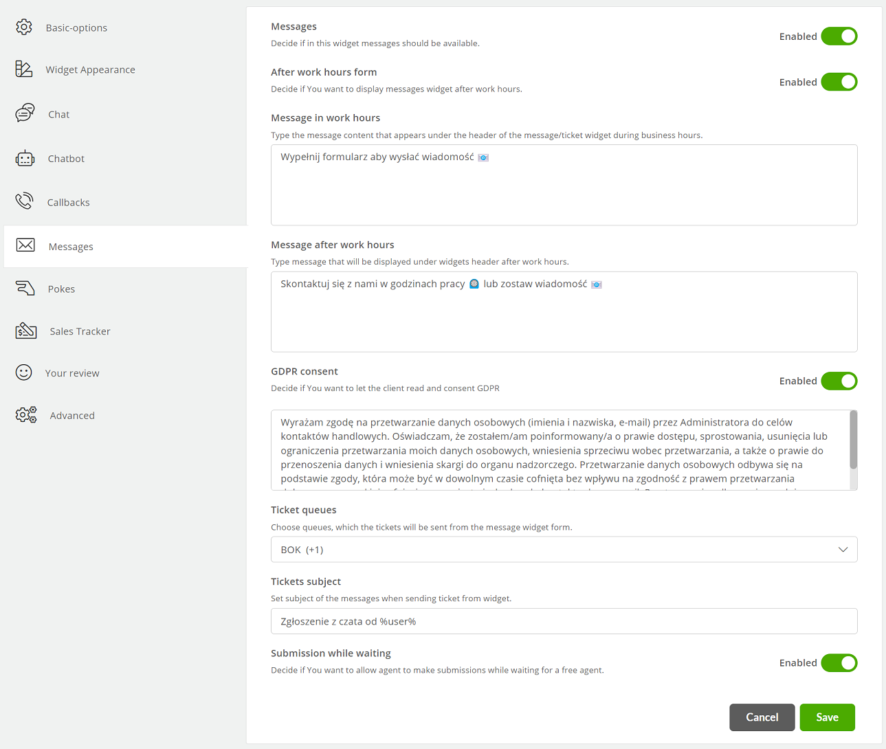
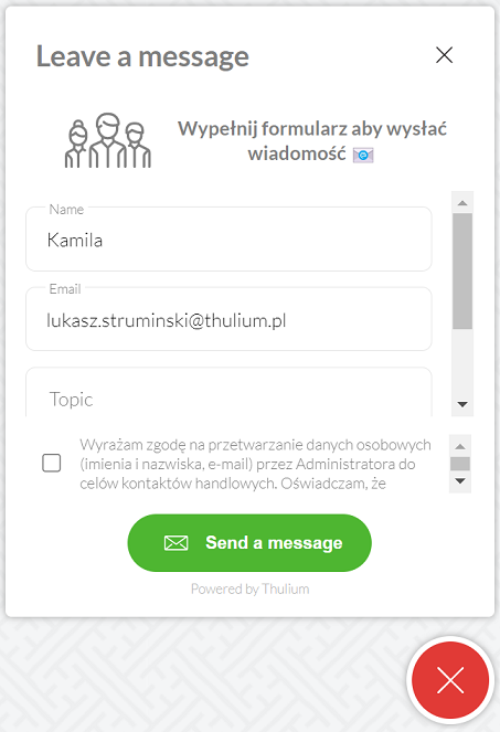
- Messages - enable the message option within the widget,
- After work hours form - decide whether after business hours a customer will be able to write a message that will go into the ticket queue,
- Message in work hours - enter the message that will appear to the customer when they write during business hours,
- Message after work hours - enter the message that will appear to the customer when they write outside business hours,
- GDPR consent - option to display a field with consent to process personal data,
- Ticket queues - select the queue(s) to which messages from the contact form are directed,
- Tickets subject - enter the subject of a new ticket from the contact form, default: "Chat notification from %user%",
- Ticket while waiting - in case of waiting too long for a free agent, the customer will have the option to leave a message.
Pokes are available for the widget when you enter its edit.
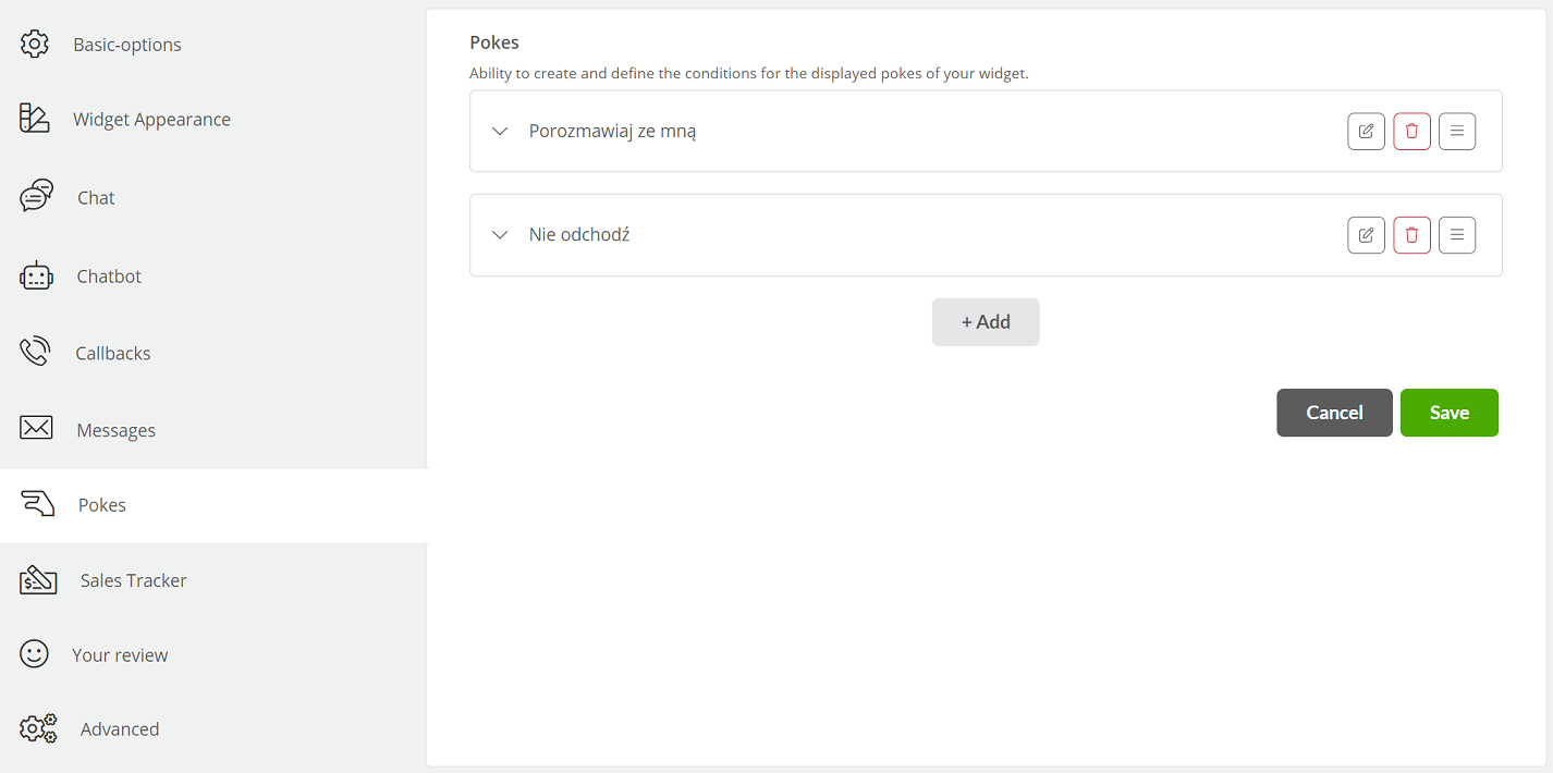
- Add - add a "balloon" to the widget with specific conditions by clicking
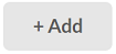 .
.
Did you know...💡
To edit an existing abutment, click  , and if you want to delete it, select the
  key.
key.
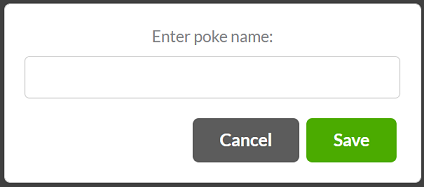
- Show agents avatar - you can select the avatar of a specific agent to appear with the display of the beck,
- Available on - select the type of devices for which the hooks will be displayed,
- Poke text - enter the content of the displayed "balloon",
- Automatic poke closure - by checking this option you can specify the time after which the attachment will disappear,
- Show poke after page refresh - decide whether you want to display the hook after each refresh of the widget page,
- Activate poke after all conditions beneath are met: - by default, the hook will appear as soon as you enter the page where you have the widget embedded, but you can add additional conditions,
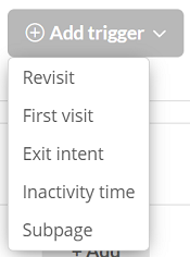
- Add trigger - click if you need additional conditions for displaying the hook:
- First visit - the balloon will appear only on the first visit to the page,
- Revisit - the balloon will not appear on the first visit, only on subsequent visits,
- Exit intent - a balloon will appear when the user wants to leave the site or close it,
- Inactivity time - a balloon will appear after a certain amount of time spent on the site,
- Subpage - a balloon will appear when the user enters a page that contains the specified fragment in the address (e.g. assuming that your page is https://example.com/pricing, then after typing /pricing the balloon will appear on the page with the price list).
Did you know...💡
The widget uses the browser's local storage to determine whether there is a first or subsequent visit to the site. To clear local storage for Chrome, for example, go to chrome://settings/siteData
Sales Trakcer is a widget functionality that allows you to track sales conversions in relation to the customer chat you conducted.
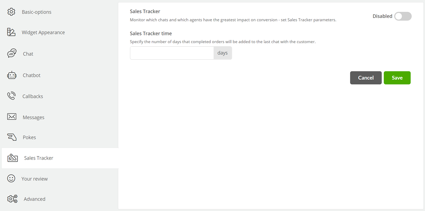
- Sales Tracker - parameter that enables the Sales Tracker module for the widget,
- Sales Tracker time - the number of days for which completed orders will be added to the last chat.
After configuring Sales Tracker, you need to place its code on the page where you finalize the order (e.g. shopping summary).
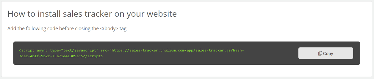
It should have one of two characters on the page (before the </body>):
- The shopping process refreshes the entire page:
<script>
    window.thulium_orderId = "#12345";
    window.thulium_orderPrice = "774";
</script>
<script src="./sales-tracker.js?hash=<hash>"></script>- The purchasing process is done on a dynamic page (single page application):
<script>
    $(function () {
        $("#click").on("click", function () {
            window._tst.trigger_sales_tracker("774", "#12345");
        });
    });
</script>
<script src="./sales-tracker.js?hash=<hash>"></script>
Where, for example:
- 774 - is the purchase amount in pennies (required),
- #12345 - order number (not required).
Important...⚠️
Remember to format the order value (pennies) correctly. Otherwise the widget may not work properly, or the system may show incorrect data.
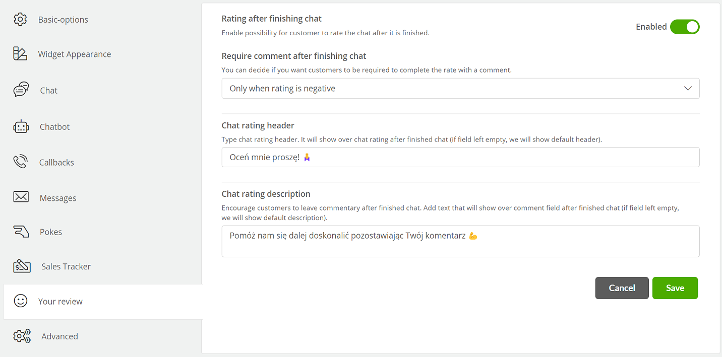
- Rating after finishing chat - the ability to enable evaluation after a chat and callback conversation,
- Require comment after finishing chat - you can decide if you want customers to have to complete the evaluation with a comment:
- Never,
- Always,
- Only when the rating is negative,
- Chat rating header - option to enter your own assessment window header (limit of 52 characters),
- Chat rating description - option to enter your own comment prompt text (120 character limit).
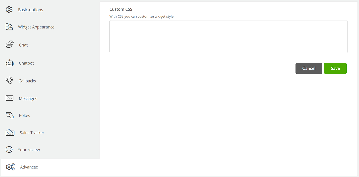
- Custom CSS - the ability to define with CSS custom styles for the chat.
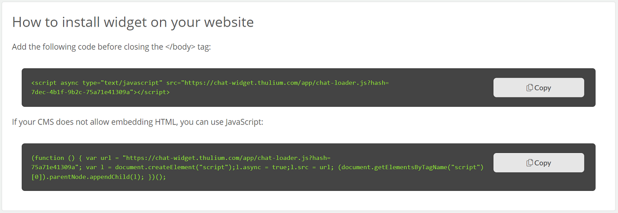
After configuring and saving the widget, place it on your site. How to do it. Just copy the generated code by clicking  and add it to the source of your page.
To edit the configuration of the widget, you need to click  , while to preview it you just need to click
  .
.

Share your opinion with us